
Auto layout is the best feature you will ever use in any design software, and today you are going to learn how to use it.
So, what is auto layout for?
Auto layout is a feature from Figma that let’s you control layout using the properties panel, this means you can have precise control over the elements you create, which ultimately enables you to design pixel perfect layouts very, very fast.

I’m going to walk you through auto layout features, and we will be creating three elements to demonstrate how you can use it in practice, so you can hit the ground running.
Let’s start by activating auto layout and creating the most classic component of all: a button
To do this, create a frame by pressing F and dragging your mouse. It’s important to note that auto layout only works with frames.

1. With your frame selected, activate auto layout by pressing Shift + A

Now, in the properties panel we are going to set up how we want our button. We can always tweak this later, but I like to start with something close to what I envision the final result to be.
2. I usually like to prepare a button to receive icons, so I will leave the layout horizontal

3. Since I tipically work with a 8pt grid, I usually go with a 12px gap.

4. For the padding, let’s set 24px horizontally and 16px vertically, so our button has enough breathing and is nice and readable.
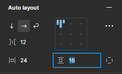
Note that you can either click drag with your mouse while hover over the field or you can type it in, whatever you prefeer.
5. Finally for the alignment let’s align it to the center

Now let’s style it
6. I will add a background color and some rounded corners


Finally let’s add the text and name it.

Done! This button is perfectly set up if we ever want to turn it into a component with variables, meaning is easy to create secondary and tertiary variants of it, as well as add icons that can be activated or deactivated.
Now that your are familiar with most properties of auto layout, let’s move on to a more complex component, where we will nest auto layout frames.
We will create a card to describe a service
This card will have an image, a heading and a description, and to achieve the result we want we are going to use some little auto layout tricks.
1. As anything using auto layout, we are going to start by creating a frame and activating auto layout.

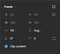
2. In the frame’s properties, I will change the width settings to fixed, so it’s easier to nest the frames on the next steps.

3. This time, we want the elements to stack vertically, and the gap to be a little wider, we can always adjust this later if we want to.

4. For this card, I want the image to stretch to the edge of the card, so I will leave both paddings at zero.

5. The top left alignment seems fine for now, so I will leave it as it is.

Now, let’s nest some frames to hold our content, we will need two, one for the image, and one for the copy.
6. First the image, I will create a frame inside this auto layout frame we just created, I will set the width to Fill Container, so it occupies the whole parent frame’s width, and the height to 240px.


Now the content, this is a cool trick I use very often, since I want the image to go until the edge of the card, I left the parent frame’s padding at zero, but I don’t want this to happen to the copy, else it looks “squished” inside the card. To solve this, I will nest an auto layout frame, and on this frame I will adjust the gap, so it only affects the copy.
7. To make it easier on us, I will name the image frame and duplicate it, so it’s already nested.

8. Now let’s activate auto layout on the copy frame, and adjust it’s properties. Width to fill container, height to hug contents, gap 8px and padding 16px. We can Ctrl or Cmd click to adjust both paddings at the same time.

9. Finally let’s style our card and place the content. I will add an off white background, rounded corners and some drop shadow.

10. Let’s select our image container and add an image, you can do this by pasting an image here or using Ctrl/Cmd + Shift + K to place an image.

11. Now select our copy container and let’s add some text using the shortcut T.

There we go, an auto layout card with nested frames.
To end this guide, we are going to combine the two components we created into a larger component: a website section, wrapping everything up with auto layout’s latest updates: min-width, max-width and wrap.
1. Again, let’s start with a frame, name it and activate auto layout.

2.Let’s change the width to fixed, and set it at 832px, we can also add a max-width of 832px, if we ever want to use this nested on another frame.

3. Leave the direction as vertical and add 24px of padding on all sides.

4. Add a nested frame and activate auto layout, this frame will hold our cards.

5. Set the width as fill container, so it occupies the whole width of it’s parent frame, and leave the height as hug contents, so it increases alongside our content.
6. Now, set the direction to horizontal and activate wrapping, we will do this so our cards wrap to new lines as they reach the edge of the frame.

7. Increase the gap to 16px so we have some breathing room, finally let’s set the padding to 0px on all sides, as we already have 24px padding on the parent section.

8. Let’s bring over our card and add a new property to it: min-width and max-width. Set both to 248px and the width to fill container.

9. Now, duplicate the card as many times as you’d like, you will see it automatically wraps onto new lines.

10. You will also see our drop shadow is cropping, so I will select the frame containing the cards and deactivate Crop Content.

Now, let’s bring our button here.
11. Nest a new frame inside our parent frame, activate auto layout and set its width to Fill Container.


12. Paste our button inside it. Since it’s in an auto layout frame, you can easily control its alignment. Tweak it as you like.

There you have it, a concise guide to auto layout with practical examples. Hope you enjoyed it!
Commentaires